KROTOS AUDIO
Krotos recognised the need to break away from a decade of unclear branding in an industry where sound and innovation converge. With their groundbreaking audio products, from iconic legacy plugins to a cutting-edge desktop app tailored for the modern ‘Creator’, the challenge was clear: redefine the brand to resonate across diverse audiences.
Role
Brand direction, art direction, UI design, video editing, image editing, & motion design
Team
Head of growth Rob Lough — Brand strategy
Timeline
Spanning through 2024 — Present

The challenge was to create an innovative and memorable identity that appealed to diverse markets—from professional sound designers to creatives in visual projects—while remaining true to its unique legacy.
Two of Krotos' ads, before the identity update:
Krotos needed a brand that resonated across all user segments. Despite being in the industry for a decade, Krotos lacked a fully developed brand identity. Its colours, typography, and creative direction were limited and undefined, and the logo was the only fixed and unchangeable element, as requested by the CEO. Achieving this would provide a more precise direction for both customers and internal teams.
Krotos' website, before the identity update:
Where we started
The project focused on developing "sound off" assets for Krotos, an audio company, to maintain the brand's essence without relying on sound. Audio-less treatments were crucial for their social media strategy, where content needed to be comprehensible without audio.
The goal was for sound to complement the visuals rather than define them, necessitating a robust visual and strategic framework for still assets and silent videos that captured the brand's energy and innovation. Additionally, the project addressed internal misalignment; the lack of clear brand guidelines had led to confusion and inefficiencies in marketing and communication efforts.
Previously, Krotos lacked a unified visual identity, resulting in inconsistent brand representation. This absence of cohesive elements hindered the communication of the brand's innovative spirit and limited its appeal to a broad audience. I've annotated some ads that Krotos ran in 2023 to highlight the issues faced, such as inconsistent colour schemes, typography, imagery choice, misuse of AI and overall design direction, which diluted the brand's impact and recognition.
Goals
Develop a cohesive brand identity that reflects Krotos' innovative and energetic spirit.
Appeal to multiple target markets, including professional sound designers and creatives in visual projects.
Design a visual system that communicates Krotos' essence without relying on sound.
Krotos needed a distinctive and recognisable identity that resonated with professional sound designers and creative content creators.
Establishing a cohesive brand was crucial for differentiating Krotos in a competitive market, ensuring it appealed to diverse audiences while reflecting its innovative spirit and commitment to quality. By creating a visual system that communicated the brand's essence without sound, Krotos could effectively engage and inspire its varied user base.
Final outcomes
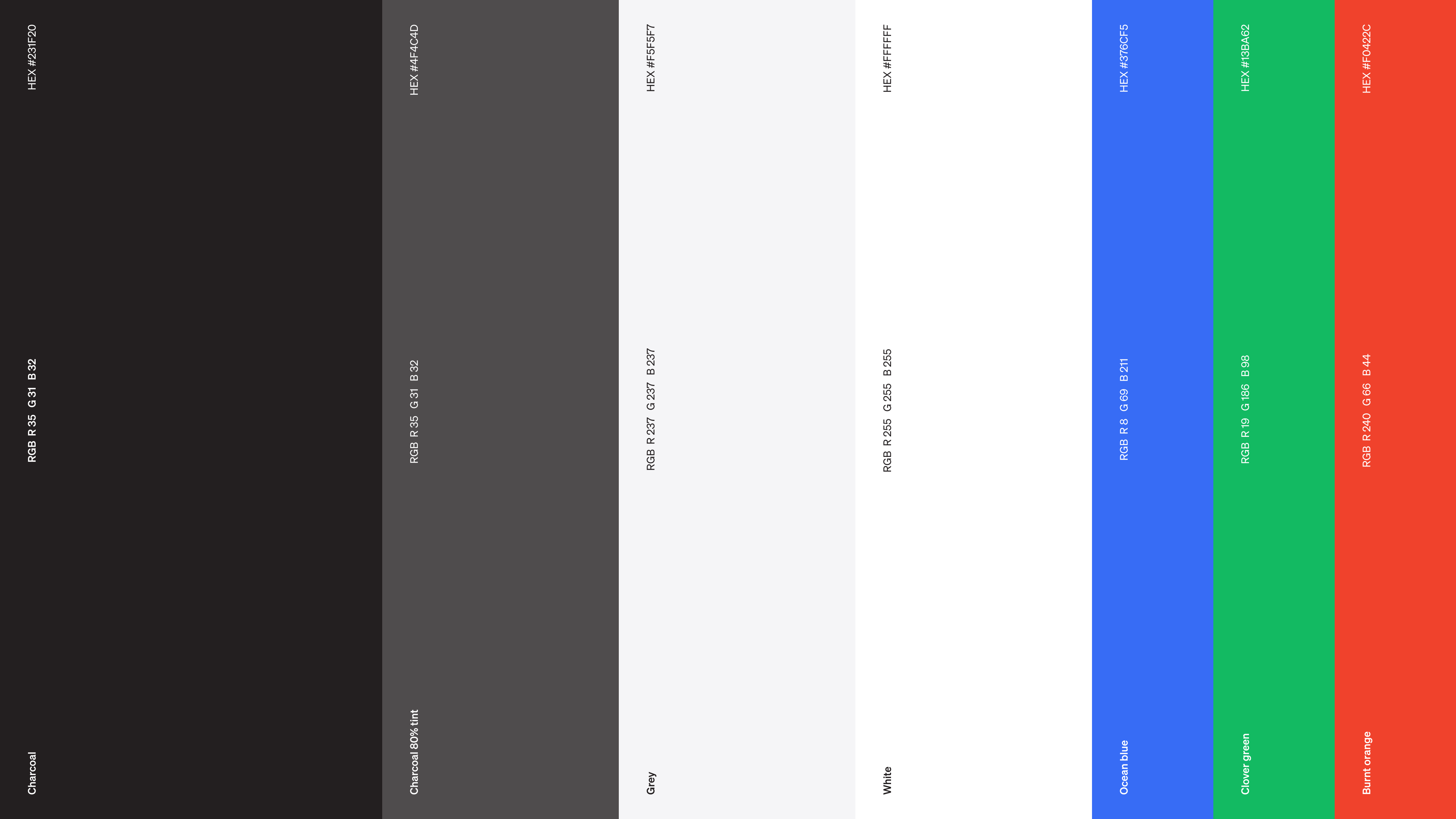
Firstly, I established a cohesive brand identity (almost) from scratch, focusing on defining colour, typography, and design direction to ensure adaptability across user segments. This effort resulted in Krotos emerging with a strong, recognisable brand that honours its legacy while leaving space for future growth.

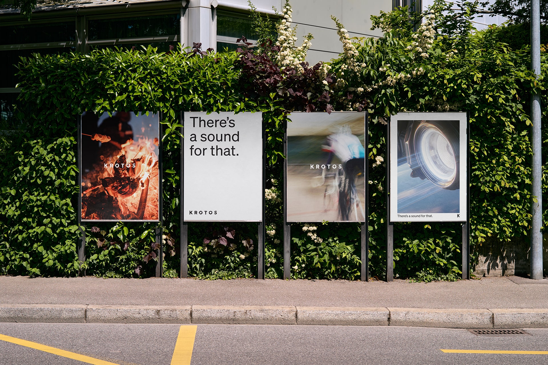
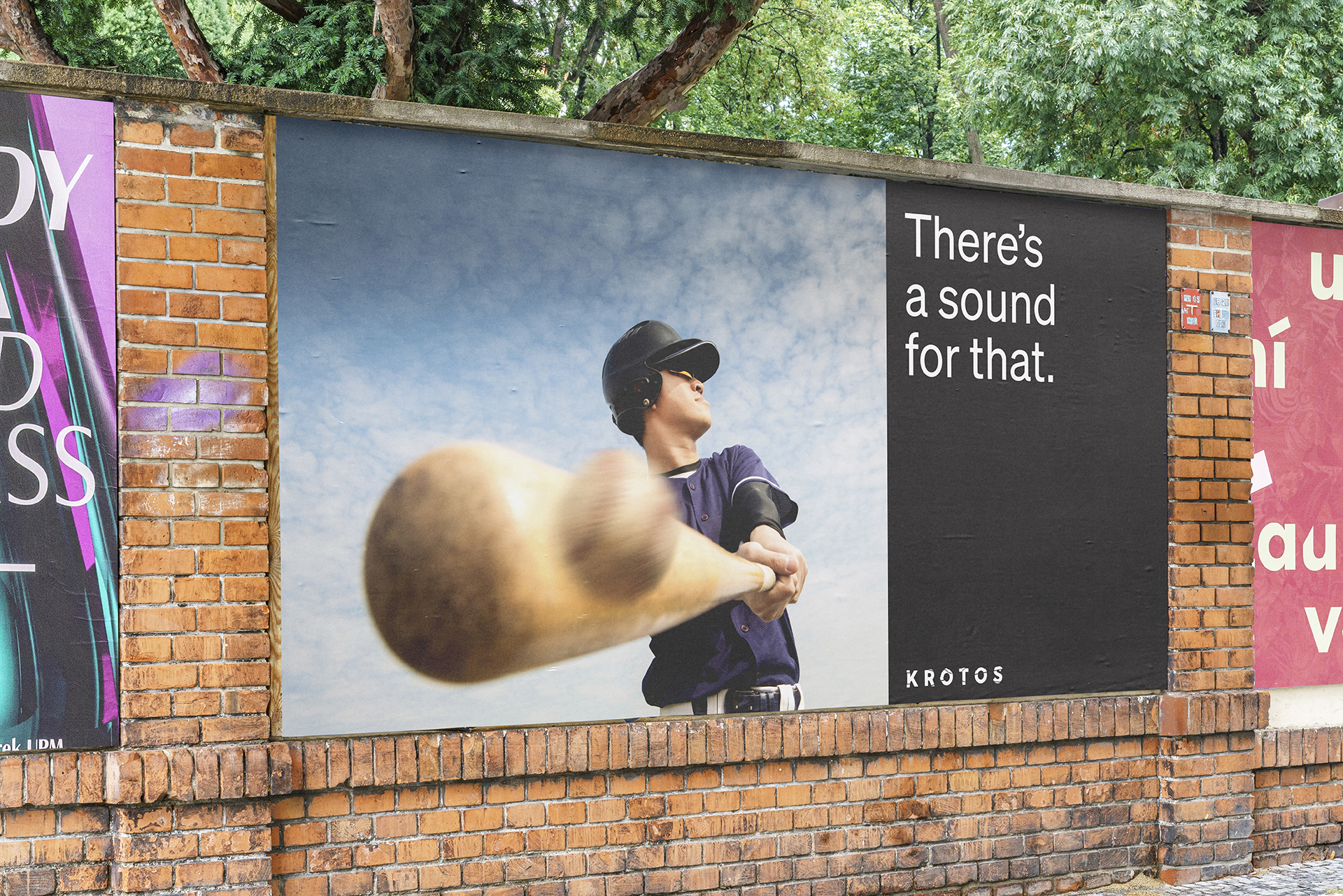
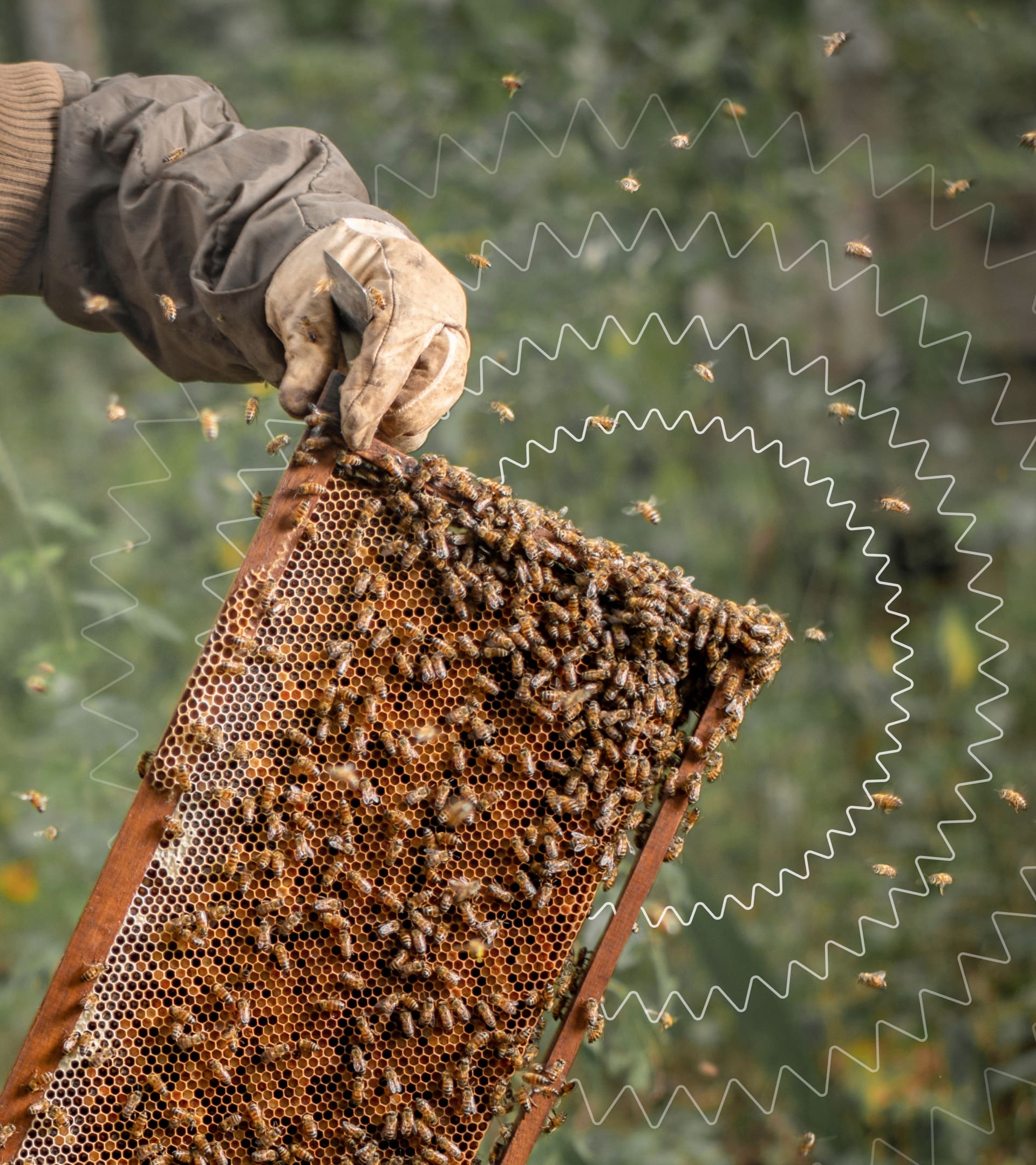
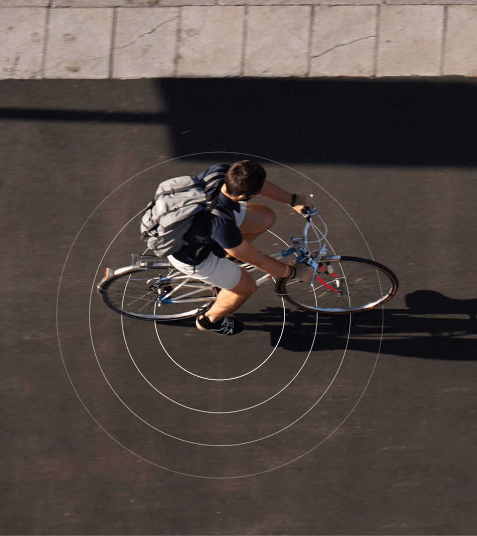
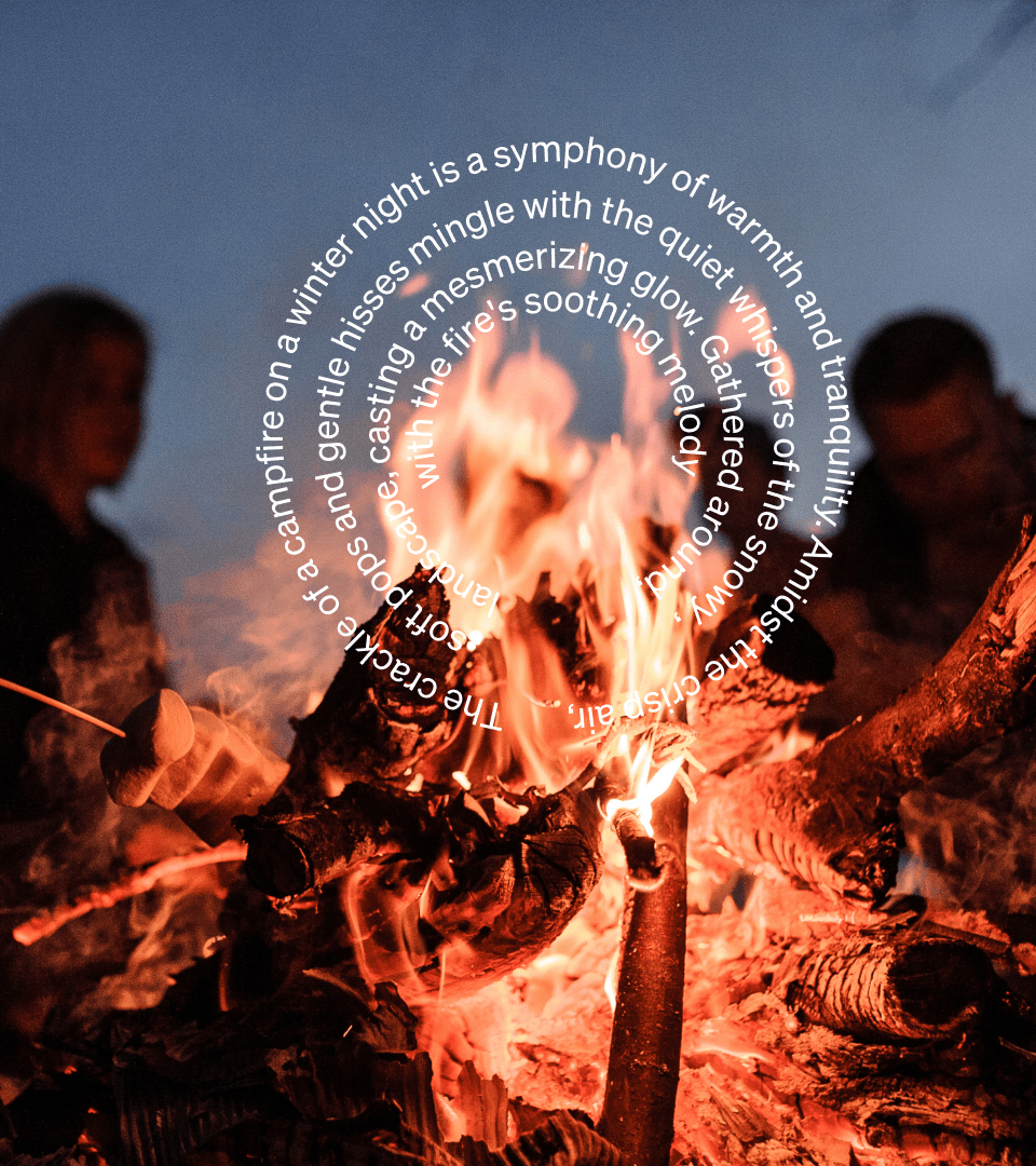
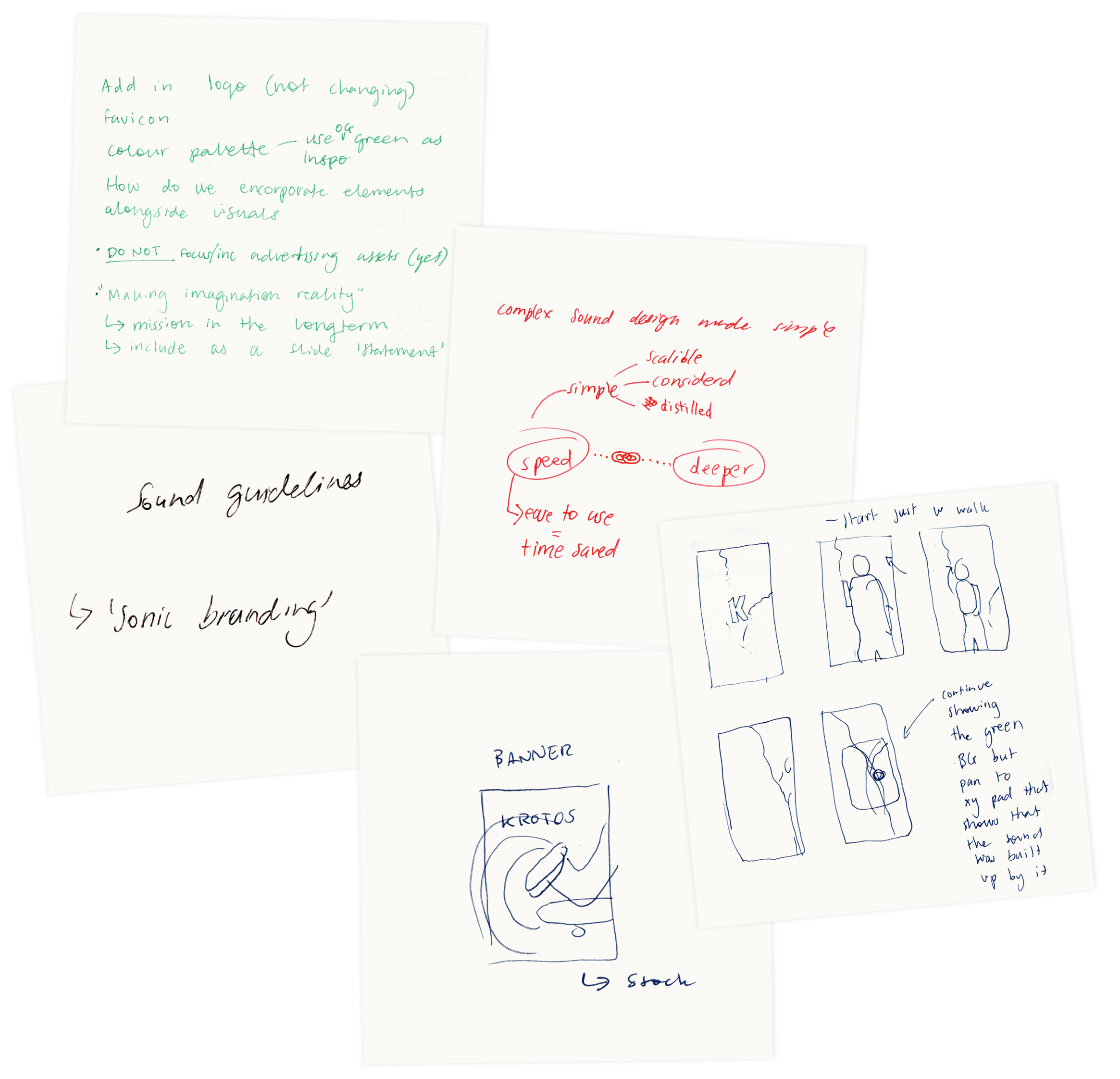
Secondly, I tackled the challenge of conveying Krotos' essence visually without sound. The solution lies in realising that excellent videography and photography engage multiple senses. By harnessing this insight, we cracked the code. The key question was, "How do we harness and define something so vast and indescribable?" I developed imagery pillars—' Movement,' 'Immersion,' and 'Fantasy'—to encapsulate our visual representations of sound. With these elements in place, all the pieces snapped together, creating a brand identity that allows viewers to 'hear' Krotos' essence through visuals.
Finally, I introduced a pattern system that visually embodies sound in GIFs, motion assets, and still imagery to enhance the visual representation of sound. This approach added a layer of 'hearing' the brand, even in silent content. The result was a unified visual identity where the brand's imagery pillars and pattern system create a cohesive and flexible identity. This new identity captures Krotos' innovative spirit, bridging the gap between existing users and a broader creative audience. The visual assets are optimised for various formats, maintaining consistency and quality throughout.
Results
Implementing the new brand identity had a transformative effect on Krotos' market presence. By establishing a cohesive and memorable visual identity, Krotos significantly enhanced its differentiation from competitors, increasing brand recognition and market share. The consistent branding across all channels improved user engagement and loyalty, fostering a stronger community around Krotos' innovative products. Internally, the clear brand guidelines streamlined marketing efforts, resulting in more efficient team communication and alignment. Overall, the redefined brand identity not only reinforced Krotos' reputation as a leader in audio technology but also drove measurable growth and success across all key performance metrics.
The impact of our new brand identity was transformative—MRR increased by over 200%, CTR soared by 1069%, and ROAS rose by 130%
This confirmed that our strategy resonated powerfully with the market, solidifying the success of Krotos’ new identity and driving measurable growth.
“Jem rocks. Hands down one of the most talented people I've ever worked with but on top of that their humility makes them incredibly easy to work with. Jemma remains on the top of my list when it comes to art direction and design talent needed for a job. This one is going to go far.”
Rob Lough, Head of Growth at Krotos
What went well
The collaborative effort between Rob and I led to us developing a cohesive brand identity. His enthusiasm and energy made the creative process seamless. The art direction naturally evolved, inspiring users about the possibilities of creation rather than focusing solely on their interaction with technology.
Challenges and learnings
Designing for 'sound off' required innovative thinking and underscored the importance of a multi-sensory approach. Additionally, working with a fixed logo presented challenges in balancing new design elements.
Looking ahead
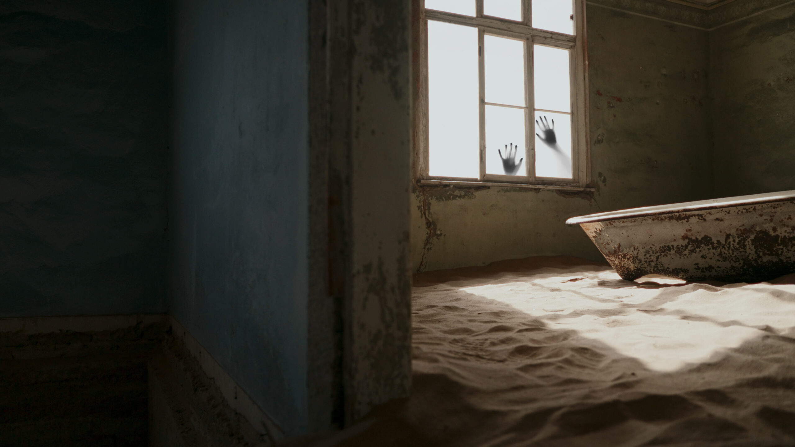
Future projects will ensure that Krotos' brand connects with the gaming and horror fanbase. This will involve creating adaptable visuals that capture the excitement and intensity of these genres, enhancing the brand's appeal and flexibility.
