NORTH SAILS
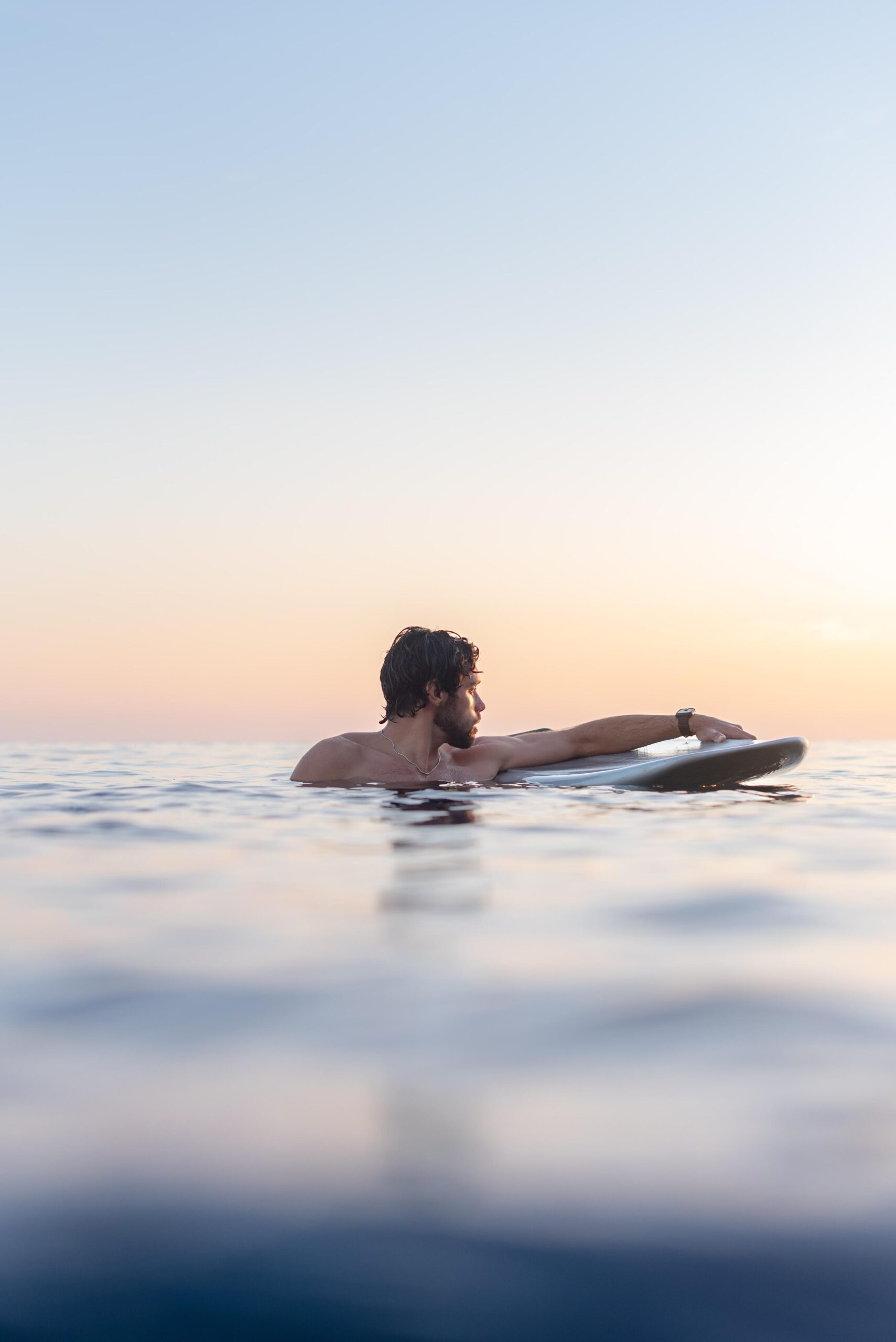
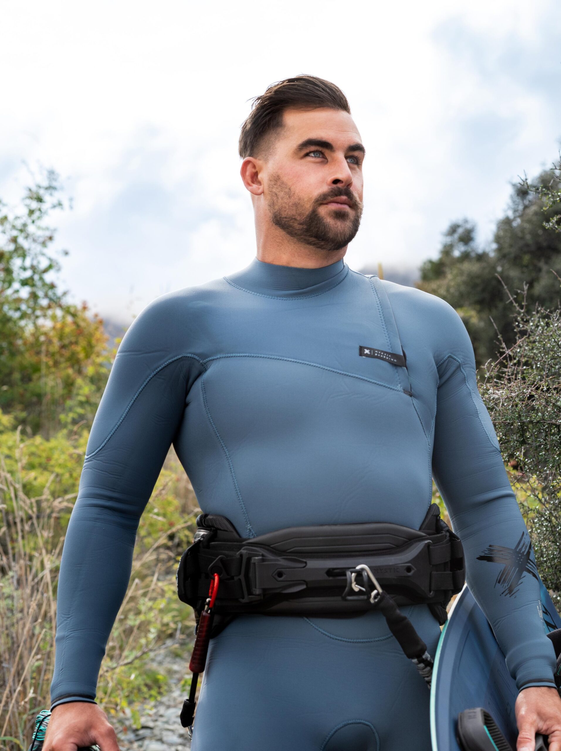
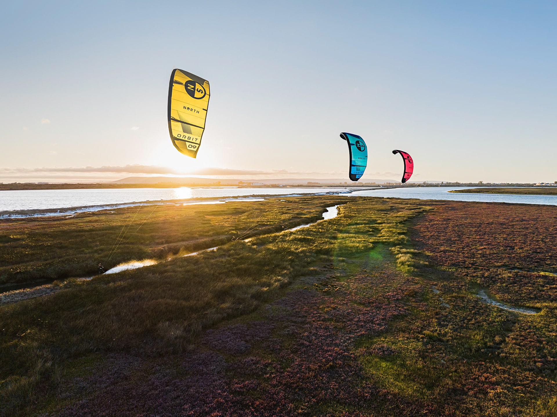
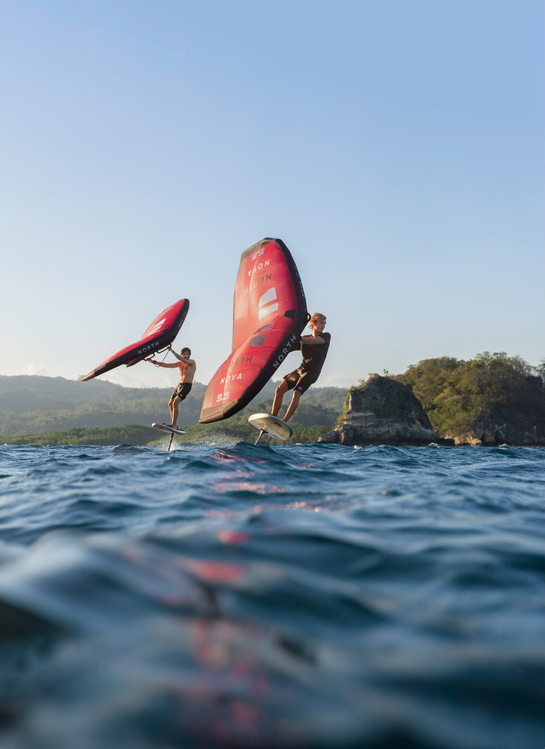
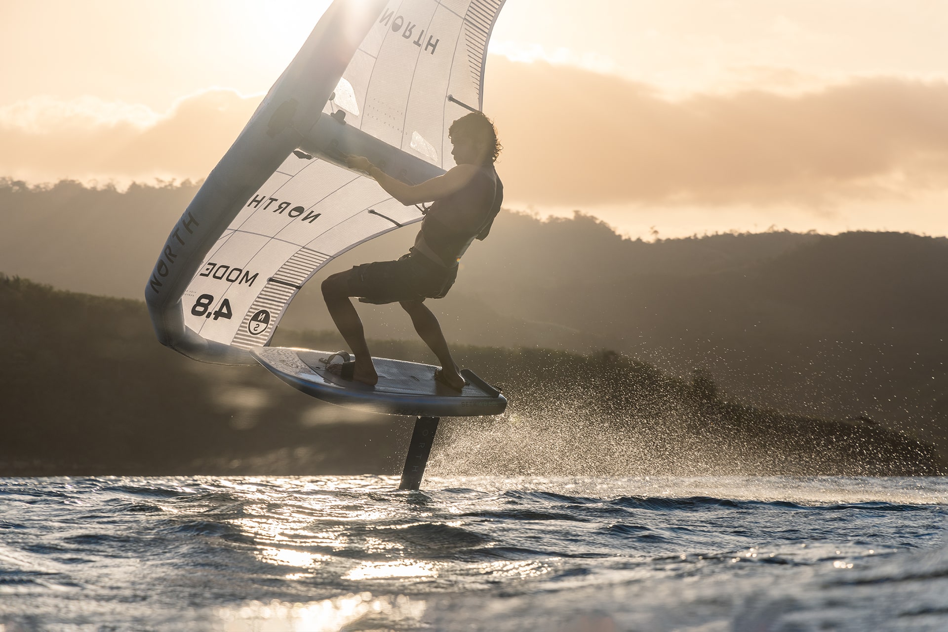
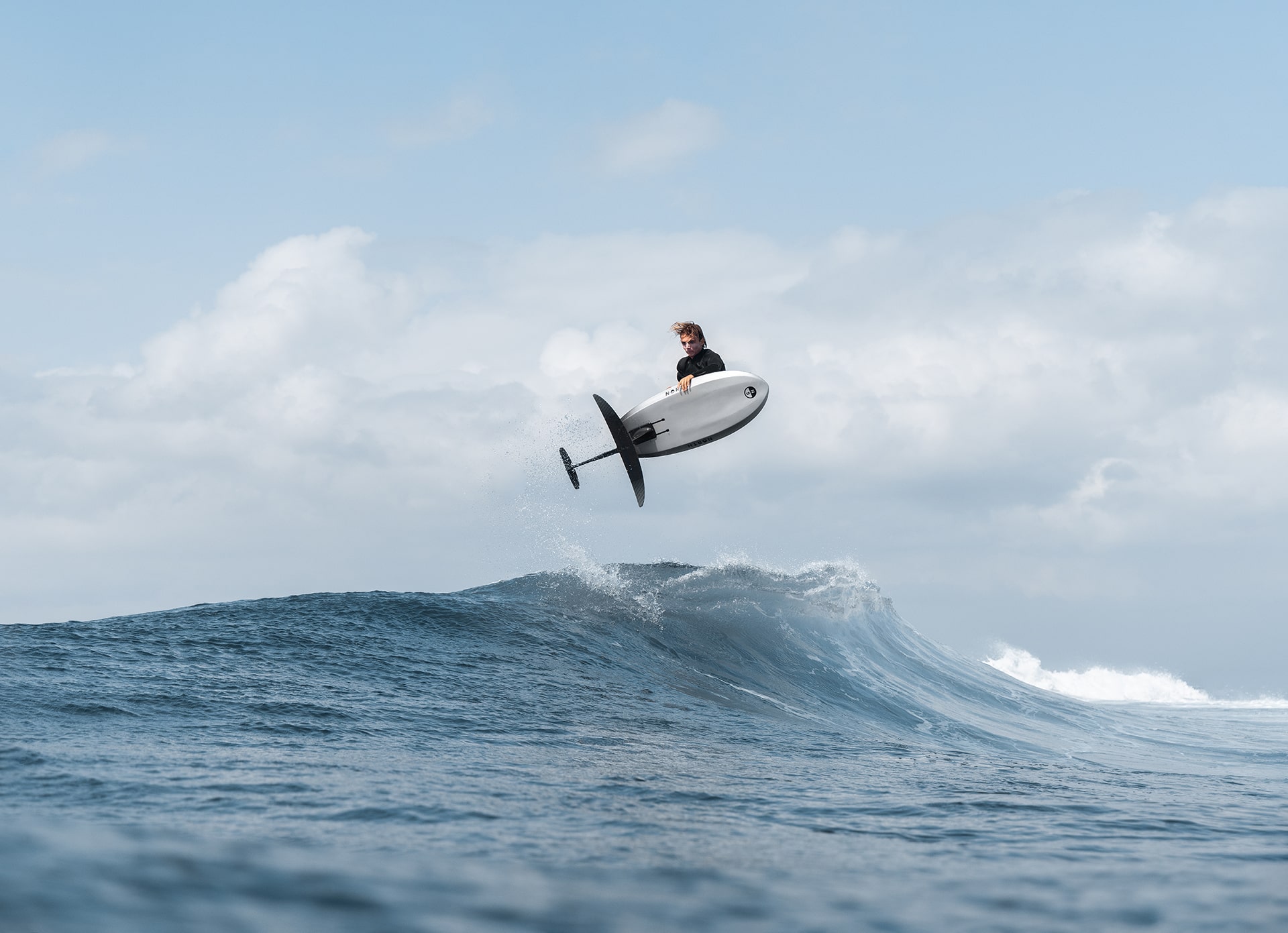
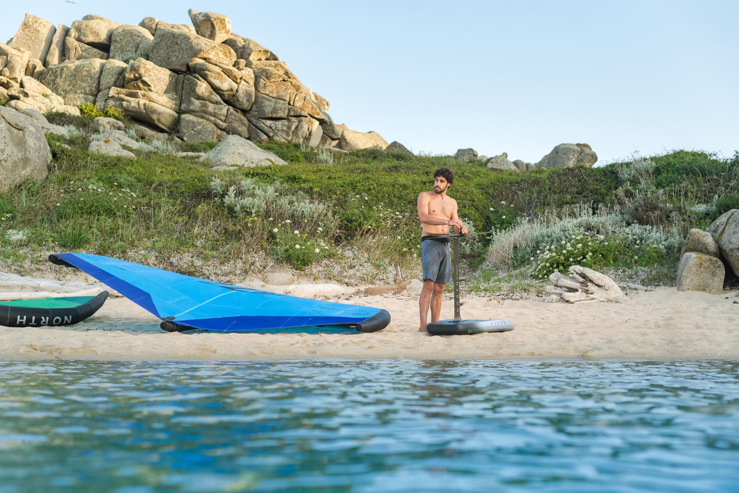
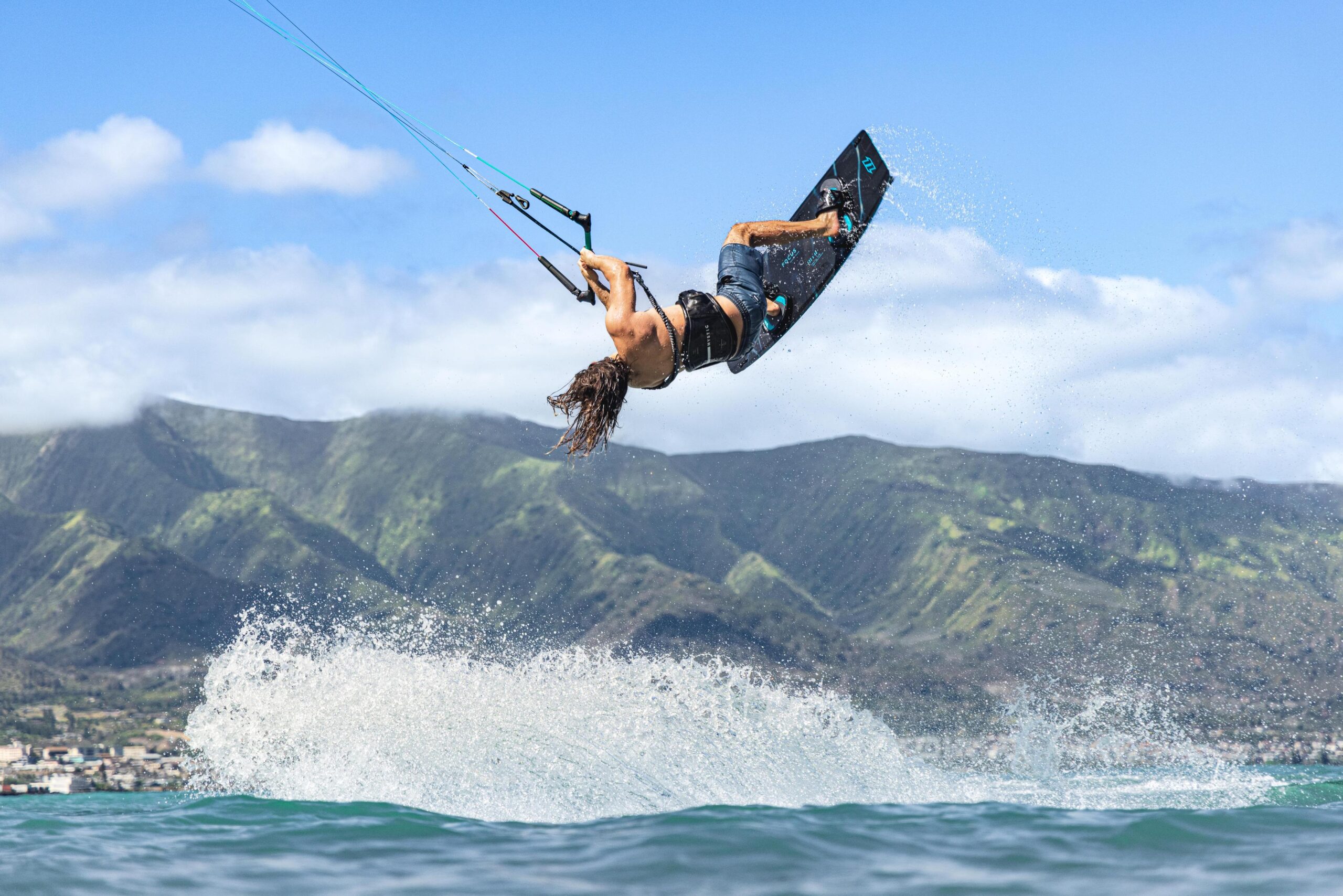
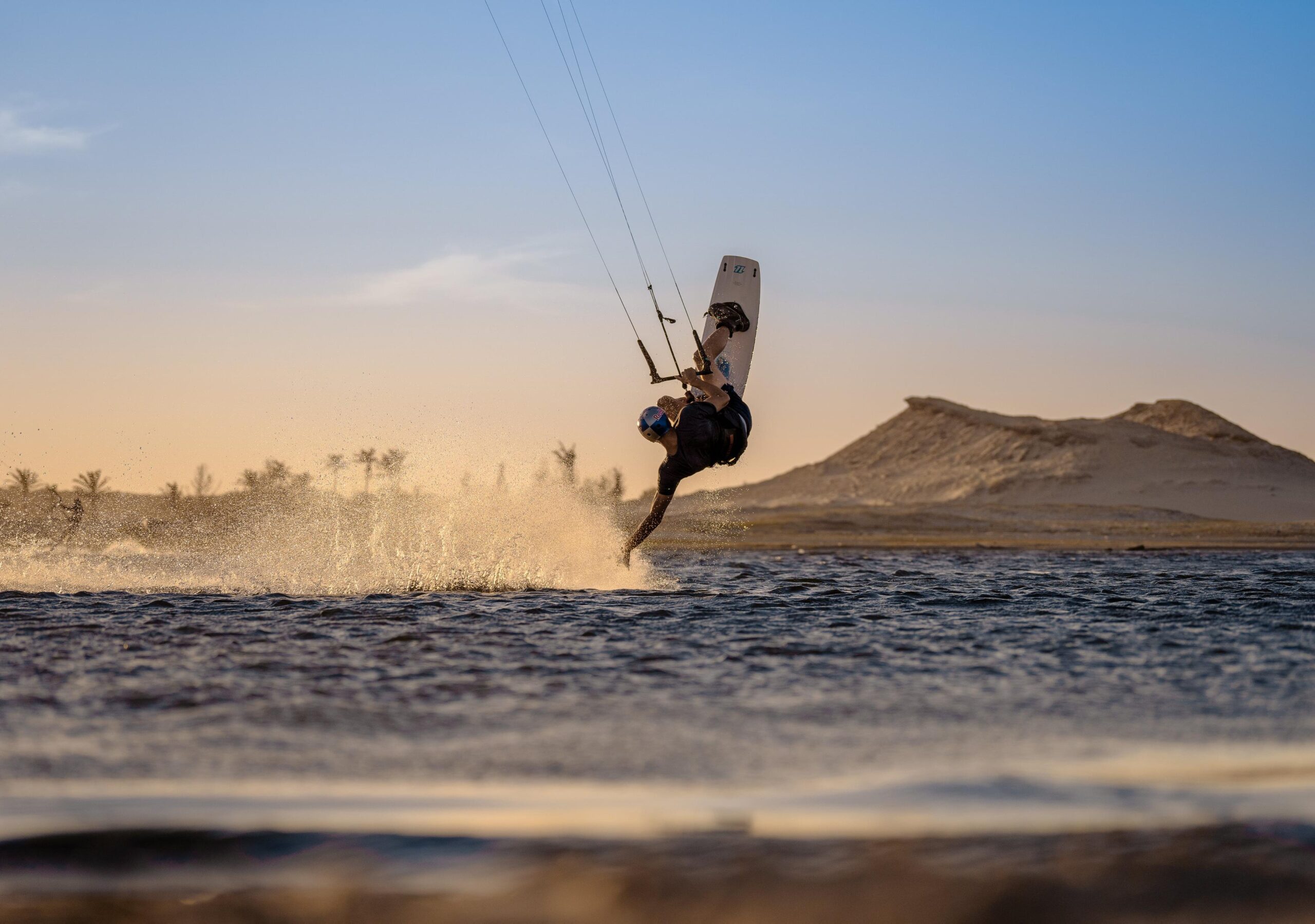
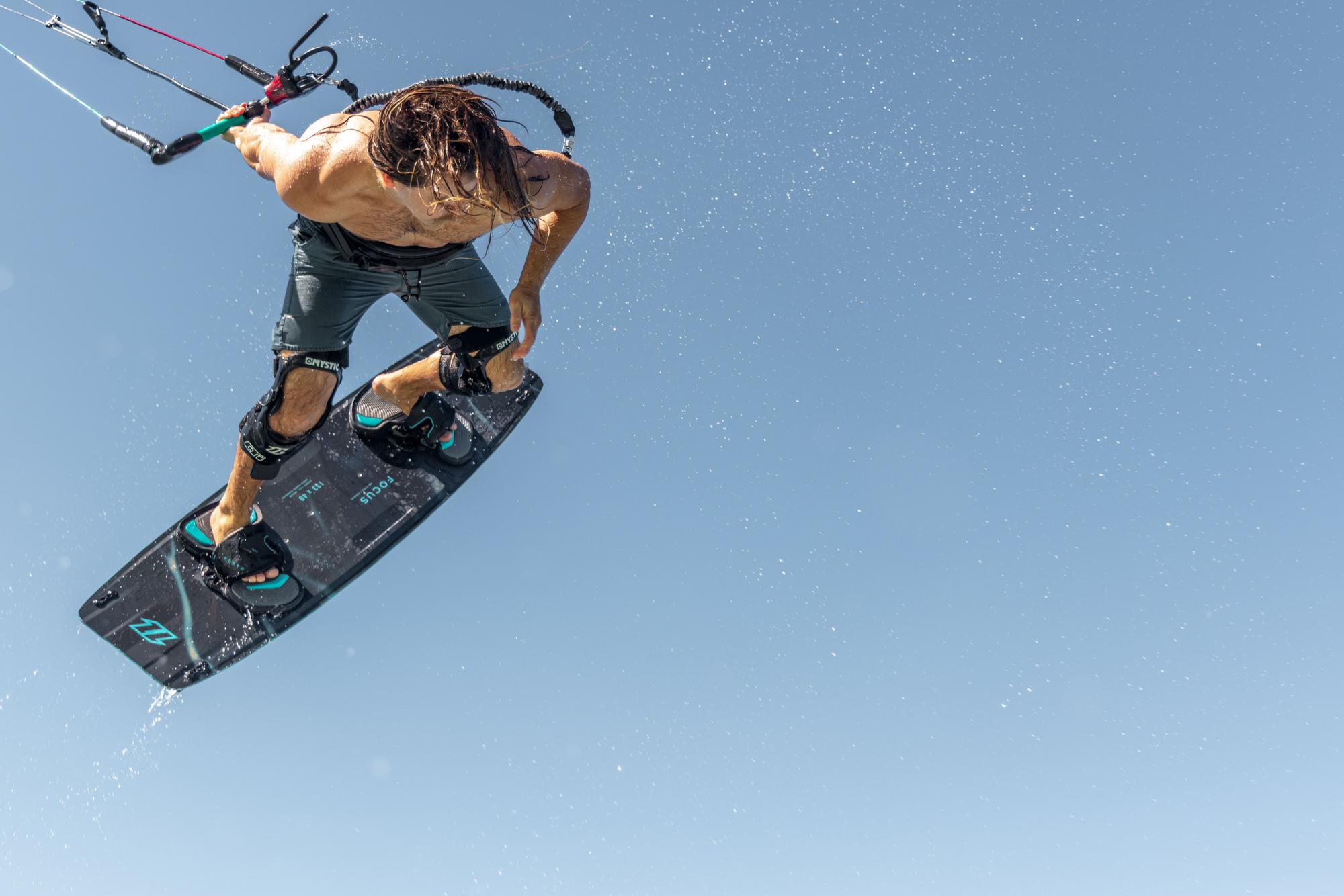
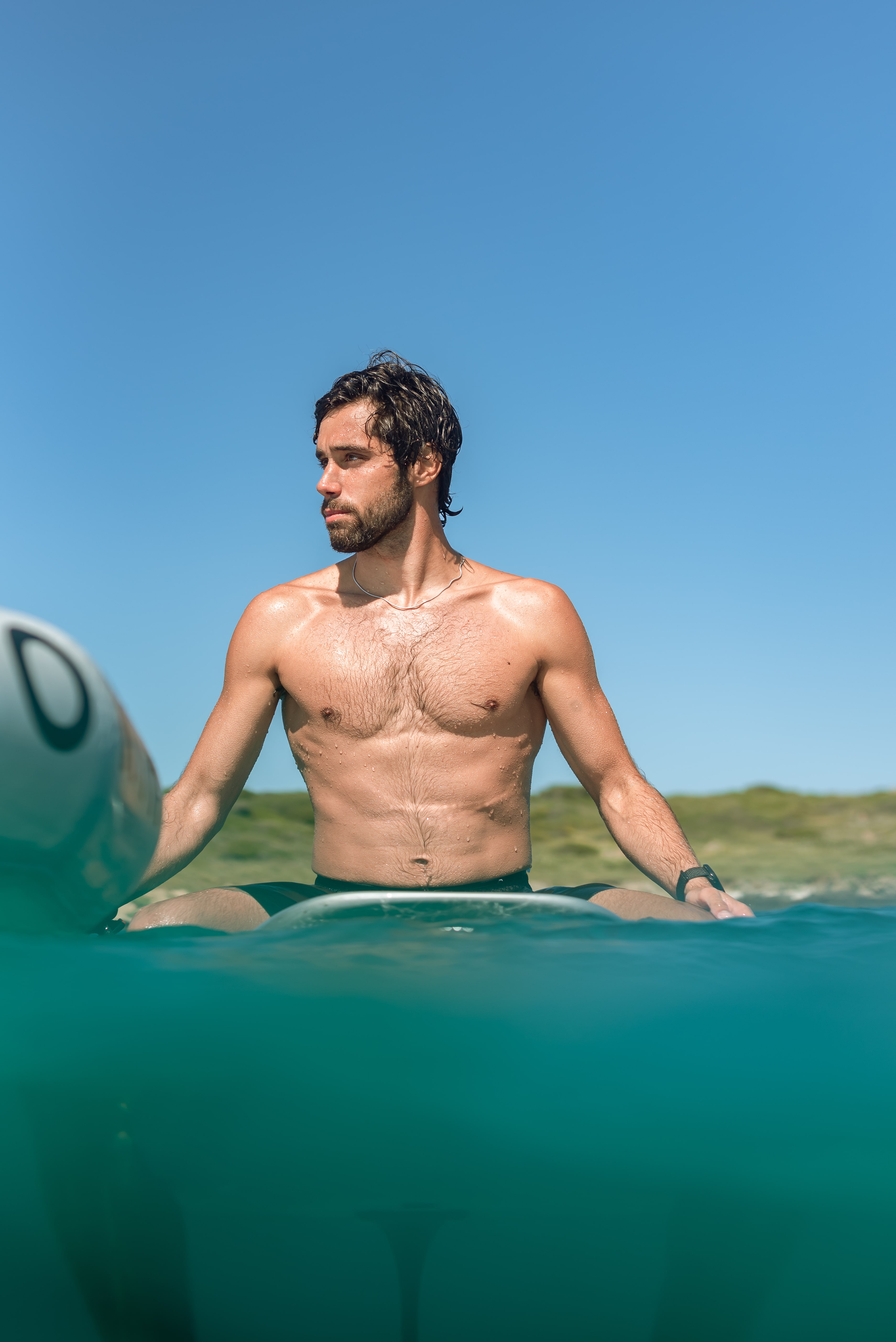
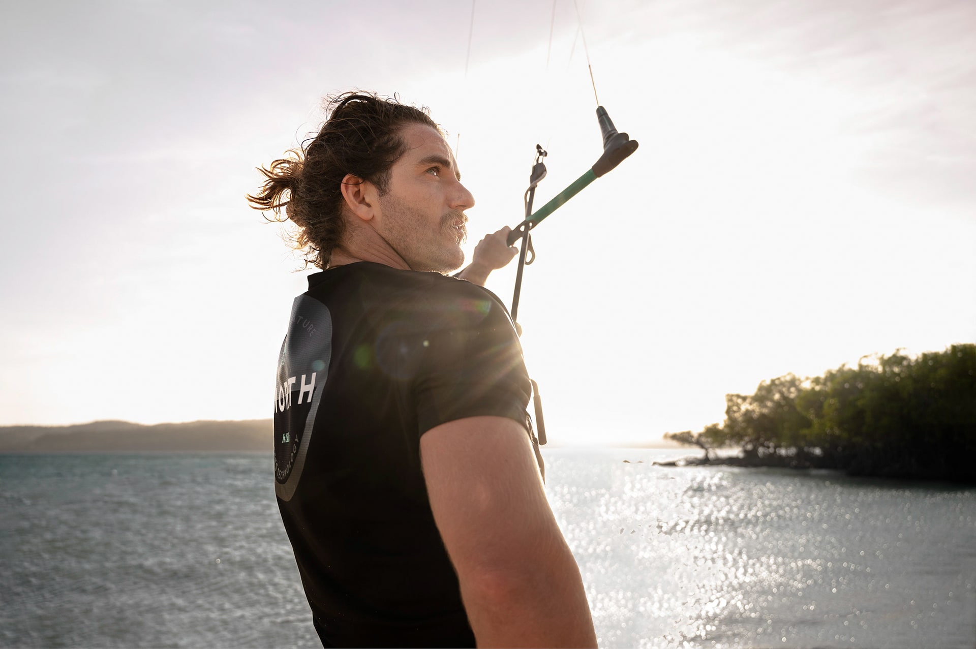
In a rapidly evolving outdoor sports market, North recognised the need to align its diverse imagery with a singular, compelling visual identity that speaks to adrenaline and nature. The goal was to curate a cohesive aesthetic across thousands of images from multiple shoots. Over a year, this aesthetic was collaboratively developed, implemented, and refined with the North team.
Role
Art direction, Imagery edit & retouch, imagery management & infrastructure
Team
5+ Photographers*, Head of marketing, designer and a production co-ordinator
*Diego Correia, Malcolm McRae, Franck Berthuot, Samuel Cárdenas, Miles Taylor, Graeme Murray
Timeline
Year-long contract spanning through 2023 — 2024
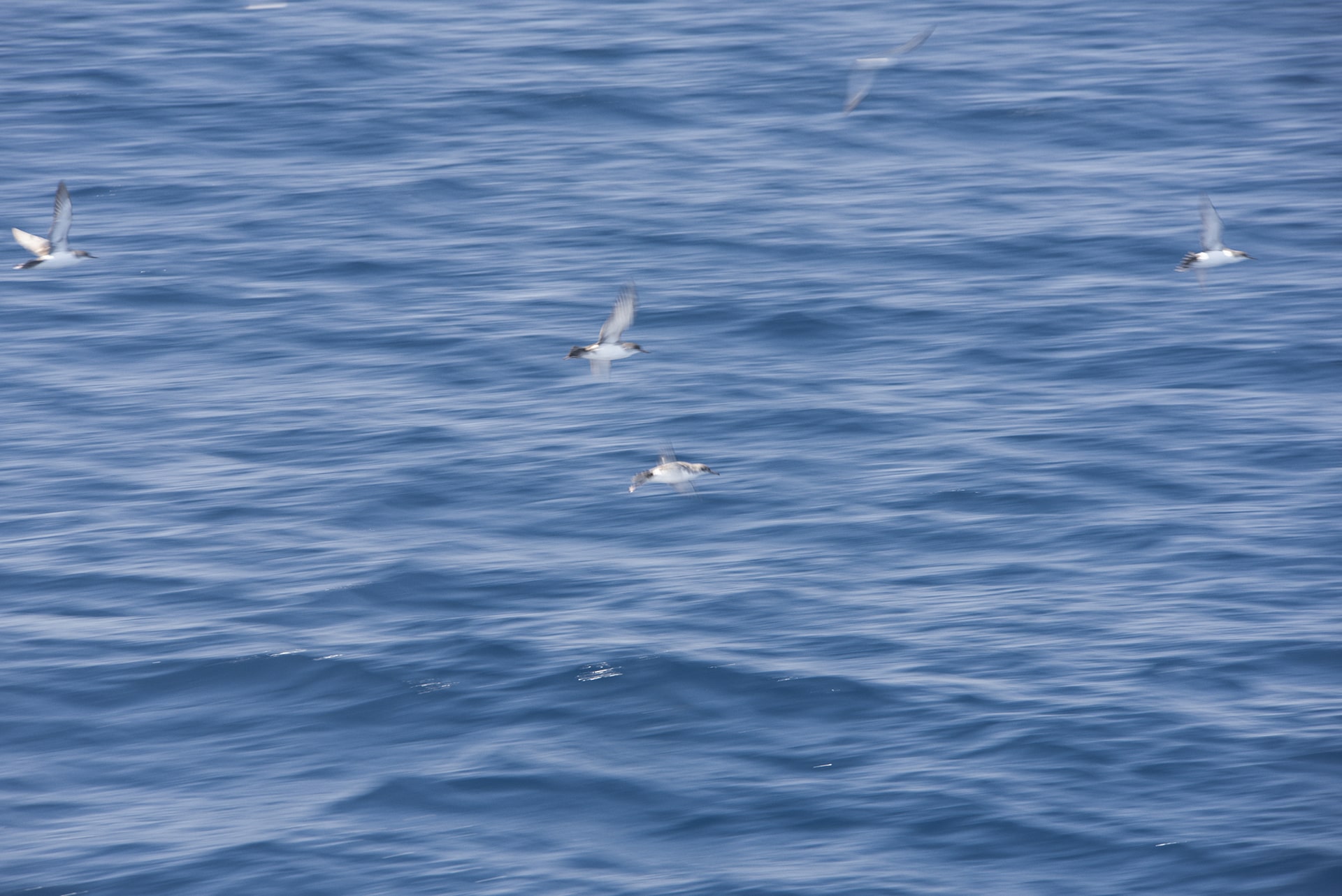
North needed a cohesive imagery direction that unified its kiteboarding and foiling brands while staying true to its connection with nature.
The challenge was developing an organic, atmospheric feel for lifestyle imagery that seamlessly integrated with their studio product shots' clean, high-performance aesthetic.
Goals
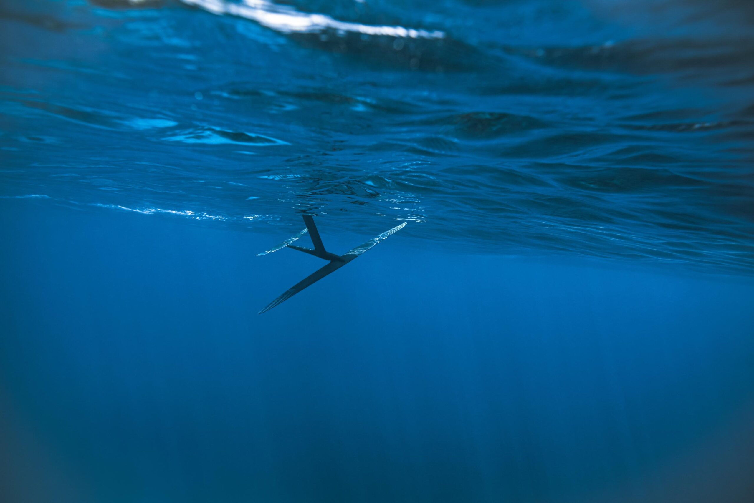
Establish a cohesive imagery direction that unifies North's kiteboarding and foiling while reflecting their connection to nature.
Develop an organic, atmospheric aesthetic for lifestyle imagery that complements studio product shots' clean, high-performance look..
Create a unified visual language that bridges the dynamic energy of the ocean with the precision of North's products.
North's brand identity needed a unified visual language that bridged the ocean's dynamic energy with its products' precision. To ensure consistency across all brand visuals and enhanced recognition and engagement.
North needed to solidify its brand identity in a competitive market by creating a distinctive and recognisable visual style. By harmonising the natural elements of its lifestyle imagery with the sleek precision of its studio shots, North could effectively engage its audience and reinforce its brand's commitment to innovation and nature. This approach ensures North's imagery resonates with existing customers and new audiences, enhancing brand recognition and loyalty.
Final outcomes
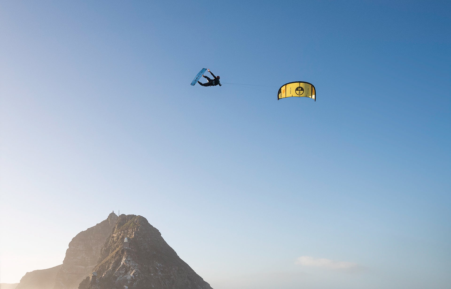
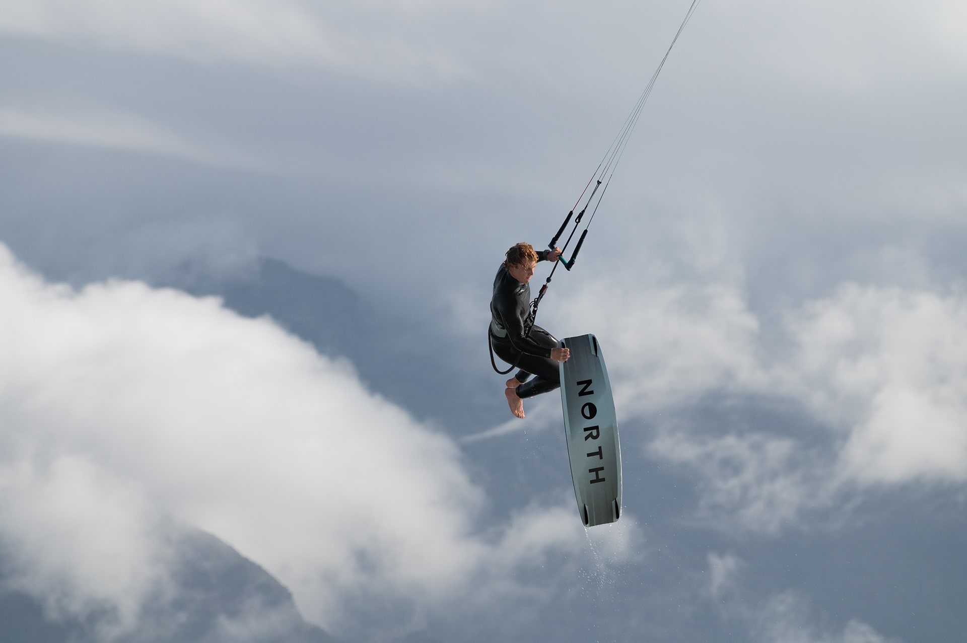
I developed a custom library of batch grades to establish a consistent style across images from various photographers and locations. This approach balanced the raw, natural energy of the ocean with the precision of North's products, resulting in a recognisable and cohesive style that unified diverse imagery.
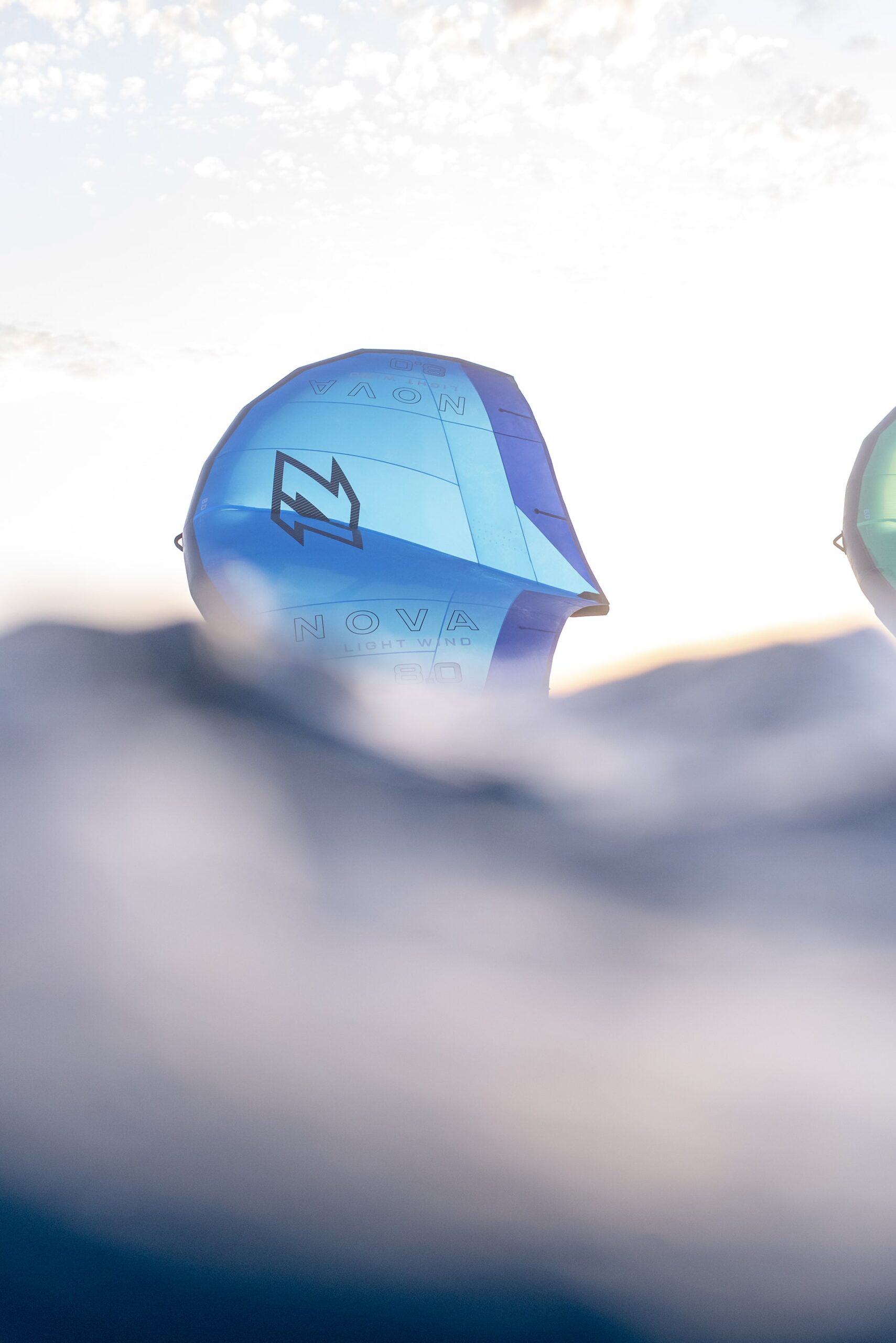
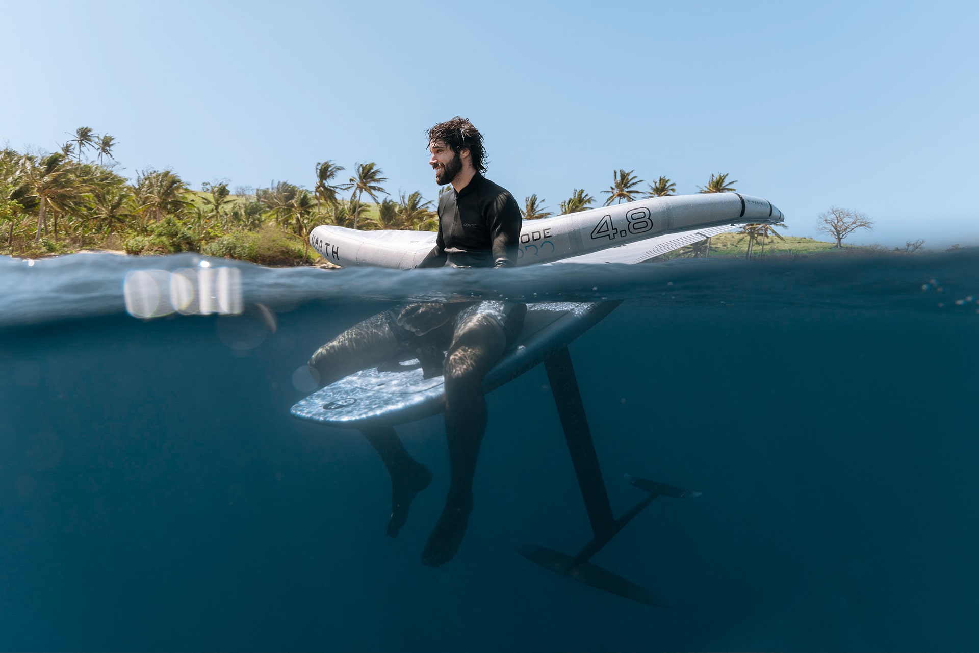
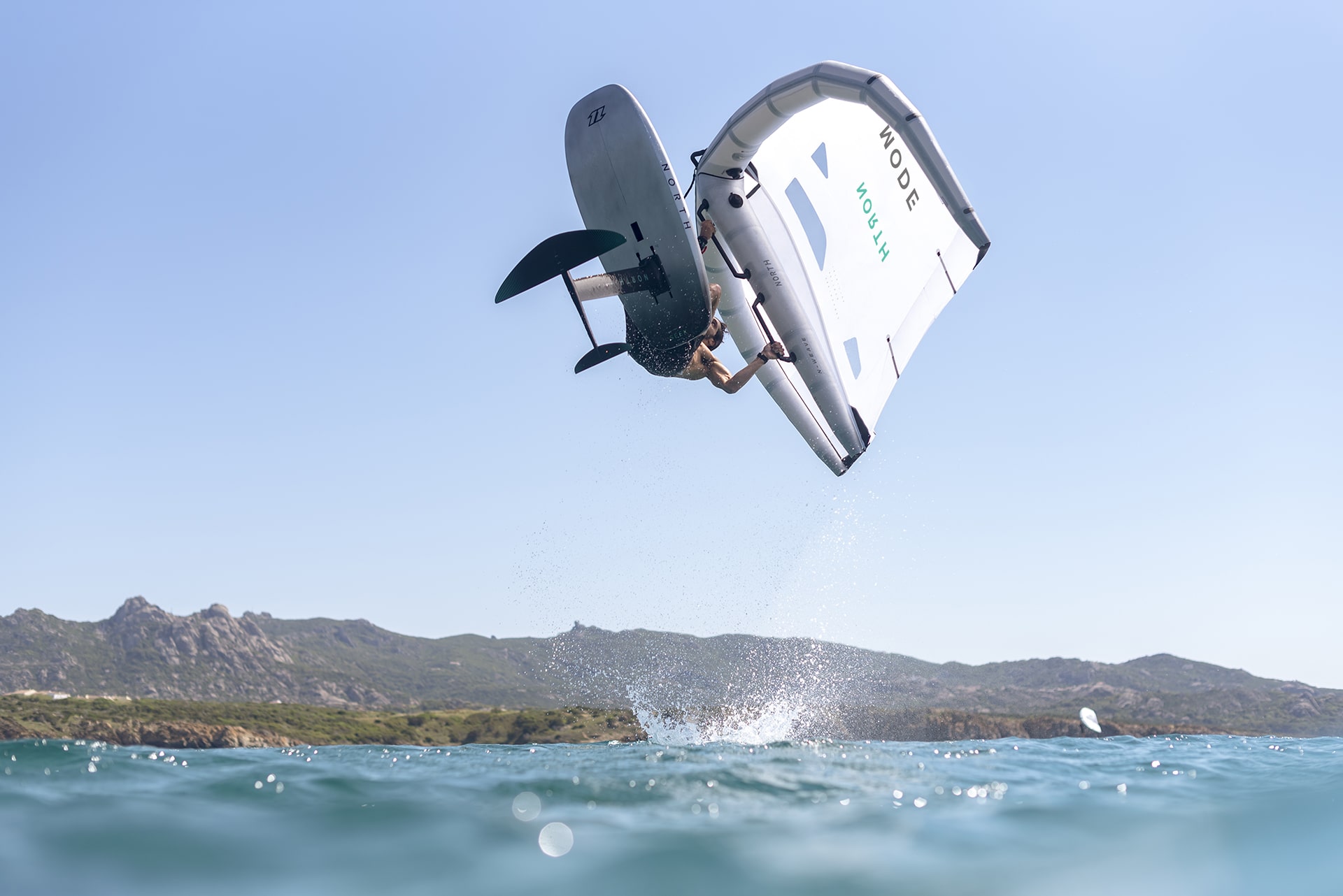
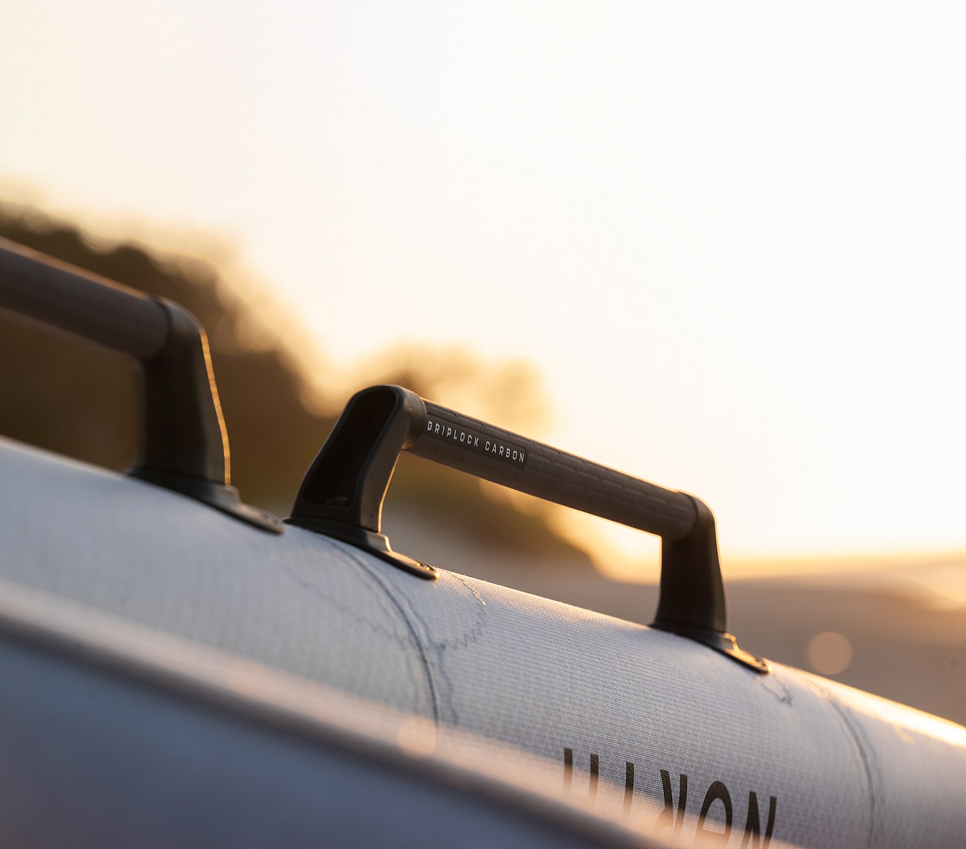
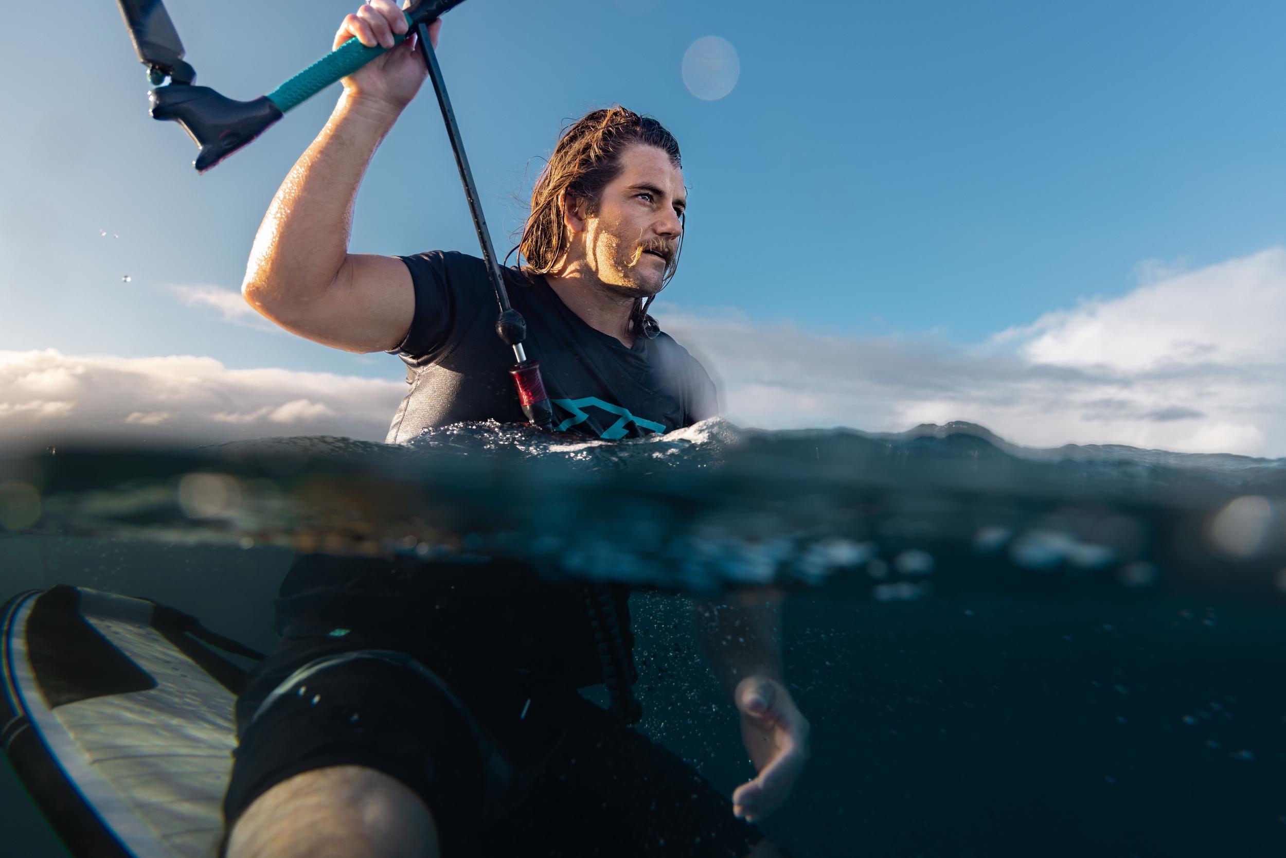
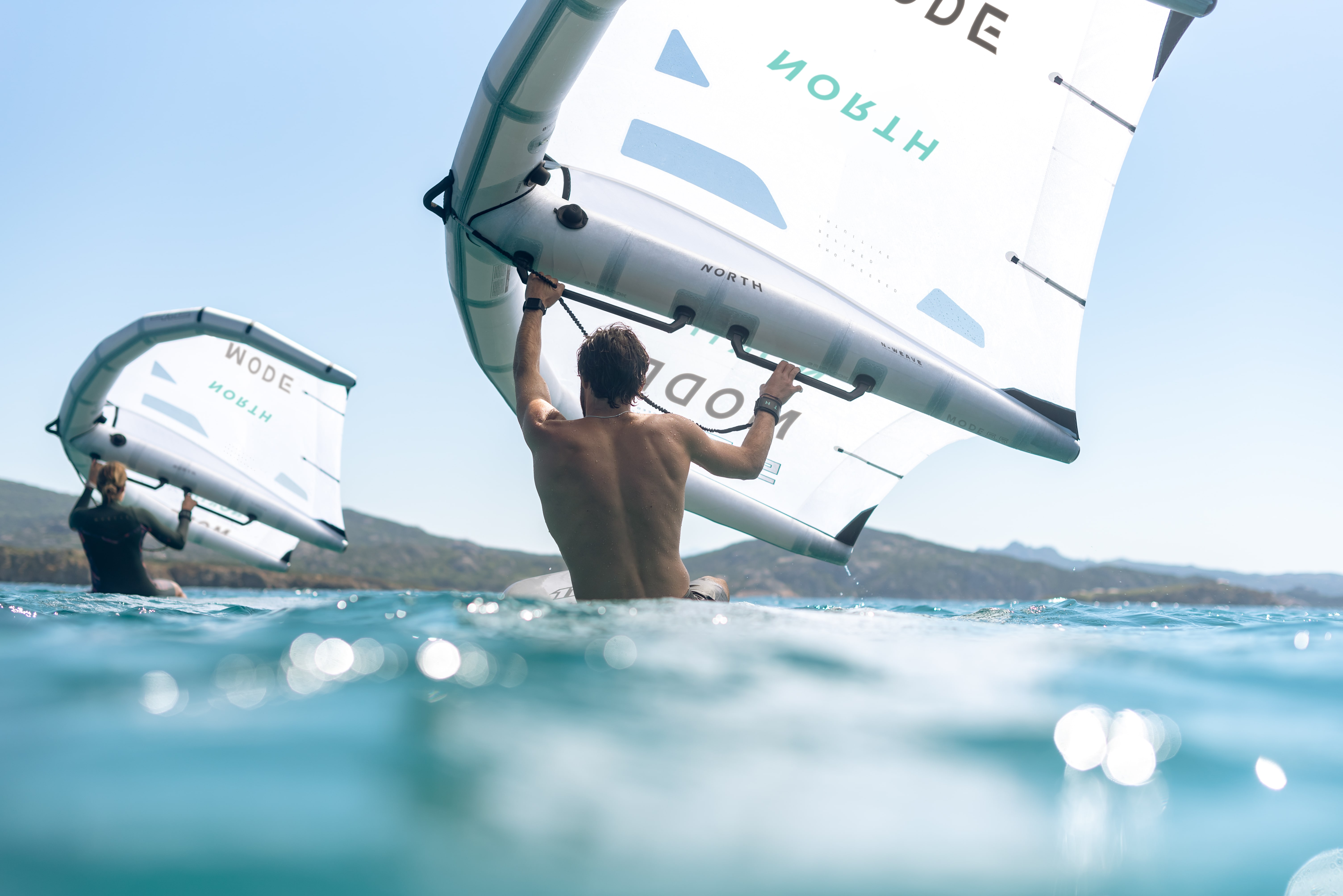
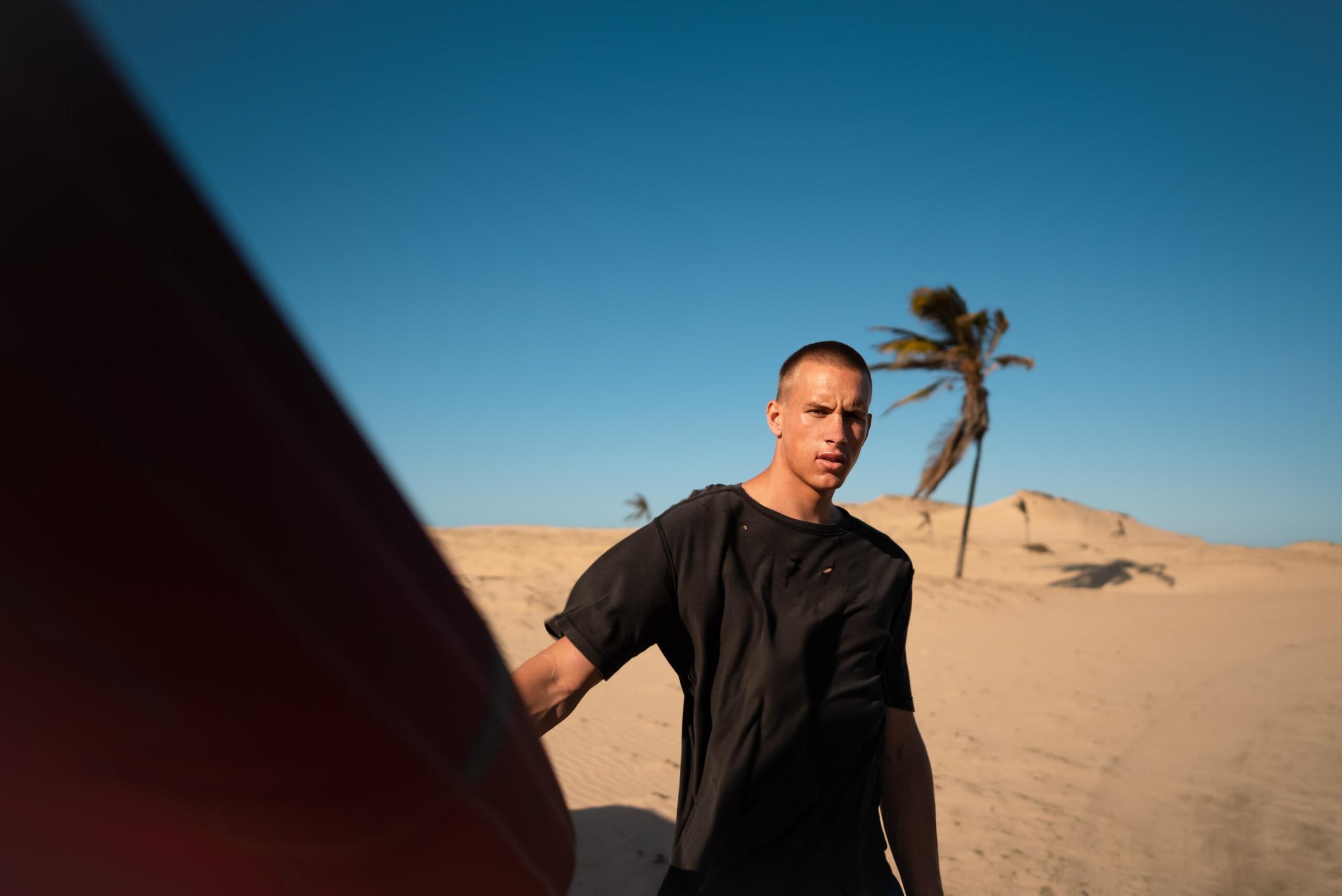
Addressing the disconnect between lifestyle images and sleek product photography, I selected close-up shots from the lifestyle shoot that captured the product in water and edited them to create a striking hybrid aesthetic. By darkening skies, I mirrored the dramatic studio look while preserving the ocean’s presence.

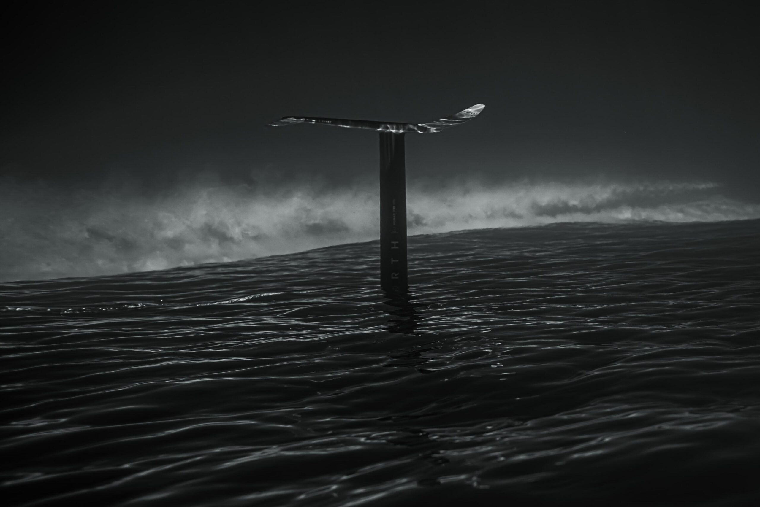
The result was visuals that seamlessly blended both worlds, producing cohesive, refined stills that are unmistakably North. I achieved this result by developing a custom grading system to harmonise the vibrant, natural tones of the lifestyle imagery with the sleek, controlled look of studio shots. Next up was creating a consistent visual language that integrates elements reflecting North's connection to nature and high-performance ethos. Each solution was designed as a larger puzzle, ensuring that every image communicated North's commitment to both innovation and nature, whether in the dynamic setting of a lifestyle shoot or the controlled environment of a studio.
Results
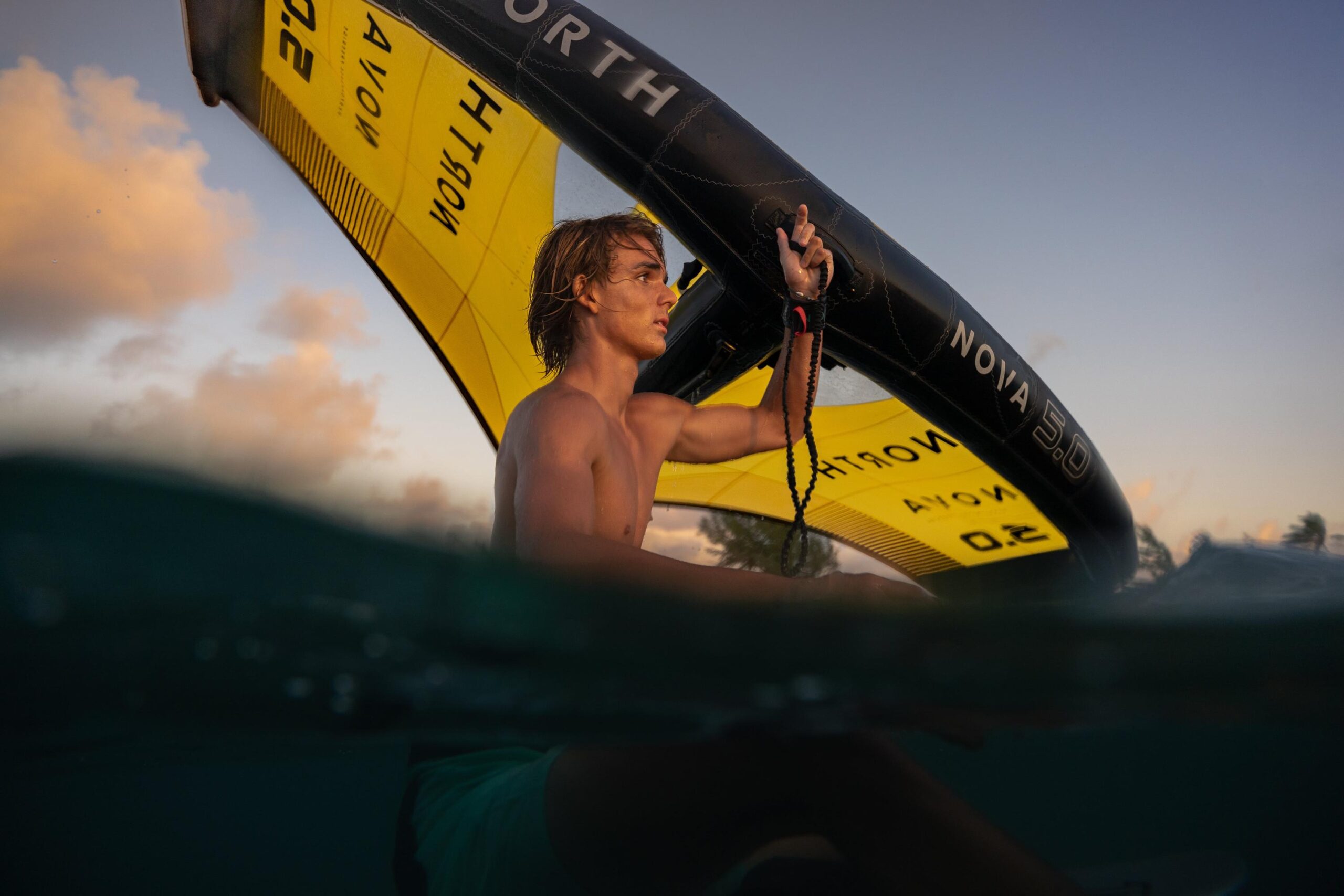
The final visuals and cohesion resulted in a unified visual identity, honouring North's commitment to innovation and nature by blending organic elements with a controlled studio look. Each set of images—from lifestyle to studio—shares a consistent aesthetic, balancing natural energy with high-performance precision. High-resolution images were optimised for social media, print, and digital platforms, ensuring quality and consistency.
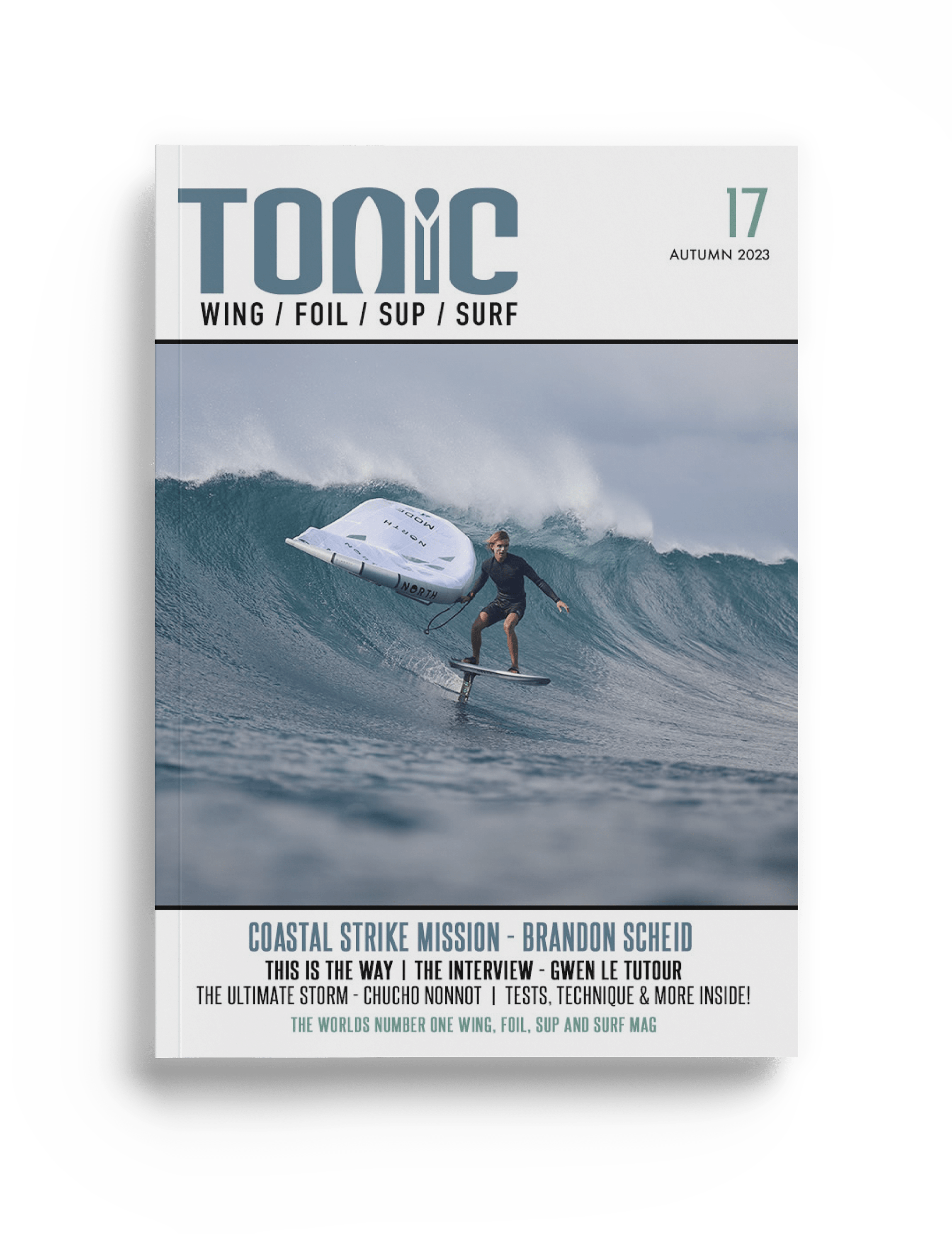
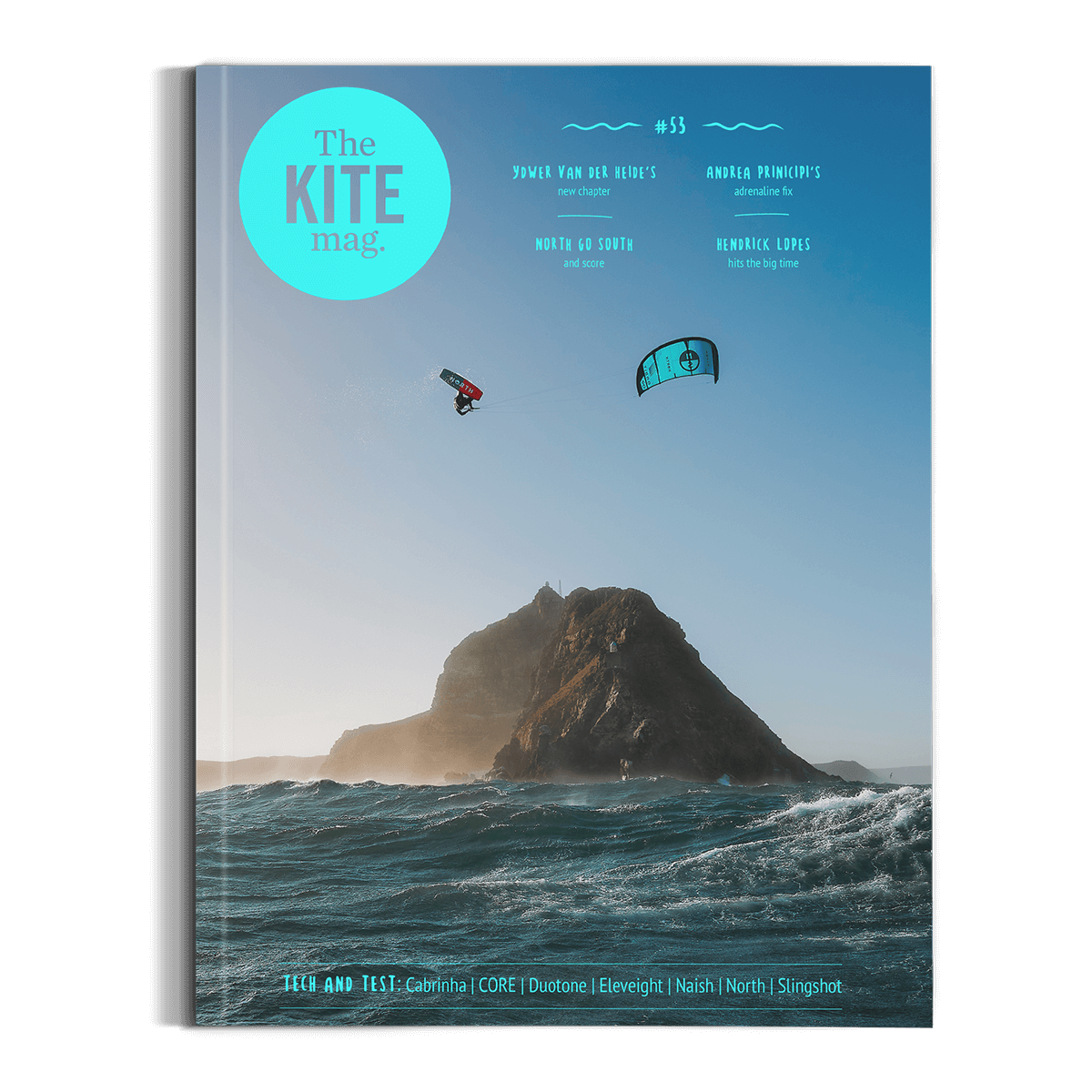
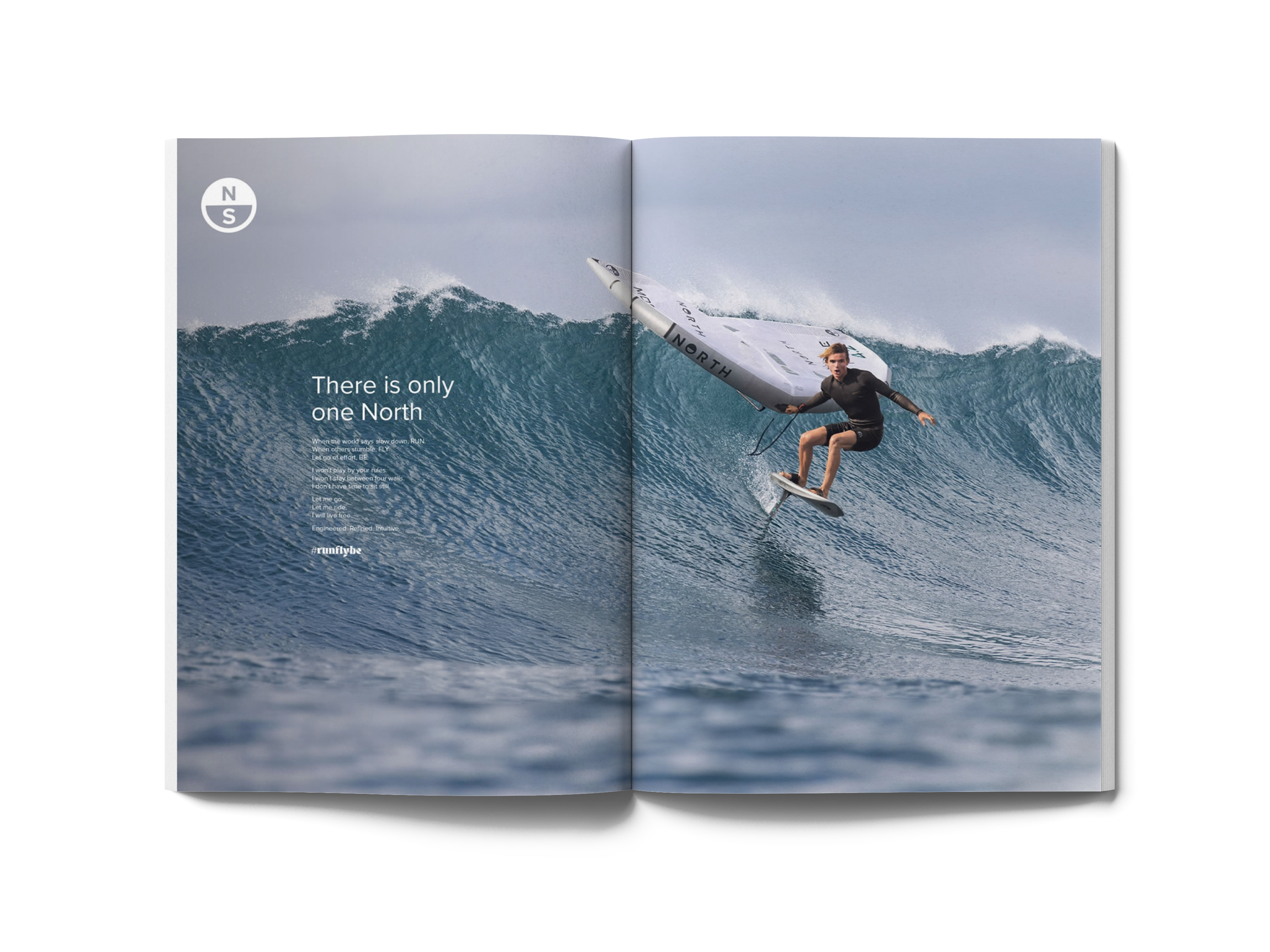
The imagery was used across social channels, print and digital advertising, and international magazines, enhancing North's brand presence and consistency.

North, in the world
What went well
The North team's clear values facilitated the execution of a cohesive, nature-inspired aesthetic. The collaborative process ensured that the imagery aligned with North’s brand identity and resonated with its audience.
Challenges and learnings
Balancing the organic, atmospheric feel with the high-performance studio aesthetic required innovative editing techniques. At times, we had to adjust our approach to ensure the visuals remained cohesive across different settings. This experience highlighted the importance of flexibility and ongoing communication with the client to refine the final imagery.
Looking ahead
These learnings will guide future projects where brand identity must be seamlessly integrated across diverse visual styles, ensuring adaptability to creative challenges.
